


Understanding the Bitcoin Rainbow Chart: An Overview
If you are a Bitcoin investor or trader, you have probably heard of the Bitcoin Rainbow Chart.
Traders often rely on this chart to forecast long-term price movements in the Bitcoin market.
But what exactly is the Bitcoin Rainbow Chart, and how does it work?

How does the Bitcoin Rainbow Chart work?
First, let’s understand how the Bitcoin Rainbow Chart works. It is a logarithmic chart that displays the long-term price movements of Bitcoin over time. It uses color bands to represent different price ranges, with the colors ranging from dark red (maximum bubble territory) to light green (good times).
The chart uses logarithmic regression to consider Bitcoin’s slowing growth rate as the price increases.
The Bitcoin Rainbow Chart is an alternative to the traditional linear price chart, which can be misleading regarding long-term price movements. The logarithmic chart allows for a more accurate representation of the percentage gains and losses in the Bitcoin market.
The Original Bitcoin Rainbow Chart
Second, it can be helpful to review the original chart for reference.
A user on the Bitcointalk forum created the original Bitcoin Rainbow Chart in 2014. The chart became popular for predicting Bitcoin’s long-term price movements.
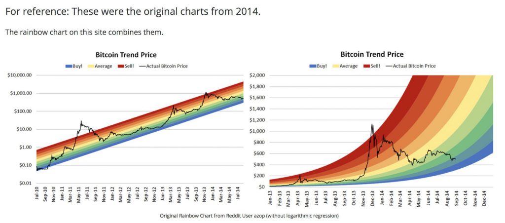
The original Bitcoin rainbow chart had six color bands. Dark red represented maximum bubble territory. It was based on a logarithmic regression of the Bitcoin price from 2011 to 2014.
Understanding the color bands on the rainbow chart
Third, let’s dive into how to read the chart.
The color bands on the Bitcoin Rainbow Chart represent different price ranges. The dark red band signifies the maximum bubble territory, indicating an overvalued Bitcoin price and an anticipated correction. The red band indicates a bubble, signifying an overvalued Bitcoin price, but an immediate correction is not expected.
The yellow band represents a bull market, meaning the Bitcoin price is increasing but a correction is possible. The green band indicates a good time to buy. It suggests Bitcoin is undervalued and less likely to correct.
The light green band suggests an excellent buying opportunity, indicating Bitcoin is undervalued with minimal correction risk. The gray band represents a bear market, meaning the Bitcoin price is decreasing but a rebound is possible.
Is the Bitcoin Rainbow Chart reliable?
The Bitcoin Rainbow Chart is not a crystal ball that can predict the future price of BTC. Its accuracy is limited by historical data and assumptions. The color bands are arbitrary and don’t reflect the current market state or future price expectations with certainty. It is a tool that can help investors and traders make informed decisions based on past price movements and market sentiment.
The Bitcoin market is volatile, making future price predictions challenging. The Rainbow Chart offers insights, but don’t rely solely on it for investments.
How should I use the BTC Rainbow Chart?
Investors can use the chart to spot buying or selling opportunities. However, as it only considers historical price data and is generally a somewhat arbitrary indication, it shouldn’t be the only foundation for making investment decisions.
Are there more crypto rainbow charts?
Traders often use the Ethereum Rainbow Chart as their primary alternative for analyzing price trends in digital assets. The creators used the same formula for this rainbow chart, but the data is limited to 2015.
Interpreting the Rainbow Chart – Buy or Sell?
Interpreting the Chart can challenge inexperienced investors and traders. The key to interpreting the chart is to look at the overall market sentiment and the current price of Bitcoin.
It may be a good time to sell or take profits if the Bitcoin price is in the dark red or red band. It may be a good time to hold or buy if the Bitcoin price is in the yellow or green band. If the Bitcoin price is in the light green band, it may be a very good time to buy.
It is important to remember that the BTC market is subject to sudden price movements, and the Rainbow Chart should be combined with other tools and indicators to make informed investment decisions.
Is the Bitcoin Rainbow Chart Accurate?
So, how accurate is the charter?
The Bitcoin Rainbow Chart’s accuracy is limited by historical data and assumptions. The color bands are arbitrary and don’t reflect the current market state or future price expectations.
It offers an arbitrary visual representation of Bitcoin’s price patterns but ignores outside influences like legislative changes or major world events that could impact the economy. The crypto Twitter community is mostly responsible for the chart’s popularity, and it is frequently used as a joke.
Conclusion – Understanding long-term price movements with the Rainbow Chart
In conclusion, the Bitcoin Rainbow Chart is useful for predicting long-term price movements in the Bitcoin market.
The chart has color bands for price ranges: dark red for maximum bubble territory and light green for good times. To make well-informed investment decisions, combining the chart with other tools and indicators is advisable.
Bitcoin investment is risky; research and seek professional advice before investing.