


Ethereum has become one of the most popular networks in the entire industry. Moreover, with the growing popularity of its native token, Ether (ETH), there exists a host of investment advice and tools to guide your purchasing. Specifically, we take a look at the Ethereum Rainbow chart and dissect just what it means.
The Bitcoin Rainbow Chart is an investment tool first created to identify the future price action of the asset. Thus, the Ethereum version of the chart provides the same insight into the potential future movement of the ETH based on logarithmic regression. Moreover, it aids investors in understanding market cycles to better assist their investments. Yet, like anything, rainbow charts are not the be-all and end-all of investment information.
What is an Ethereum Rainbow Chart?

The Ethereum rainbow chart is a visualization tool created by @rohmeo_de that seeks to inform investors about the future movement of Ethereum’s price. Subsequently, the tool utilized color-coded bands that visualized the price levels of ETH. Thus, informing a decision based on prediction and current standing.
The colors all signify different values of the asset; for example, some represent the asset as significantly undervalued or vice versa. Thus, investors have a clearer picture of when they should invest in a specific asset. By displaying the market cycle and a visual breakdown of price history, you can be more informed when making an investment decision.
What do the Colors Mean?
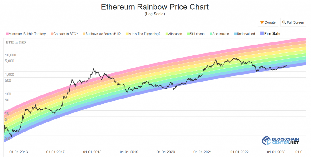
Because the colors of a rainbow chart signify the ETH price, it is important to keep in mind what these colors mean. These color bands show the observer the specific level of valuation. Moreover, the colors range from red all the way to indigo.
The red zone represents a significantly overvalued level, while the orange zone represents an overvalued level. Moreover, the yellow zone indicates a slightly overvalued stance, while the green zone is indicative of a fairly overvalued stance. Finally, the blue zone represents an undervalued asset, while the indigo zone shows it to be significantly undervalued.
Like the BTC rainbow chart, the ETH rainbow chart is simply an investment tool. Meaning that the rainbow is indicating potential future price movement but is not assured of that movement. Therefore, it is important to combine this tool with other research for long-term investment success.
Ethereum Rainbow Chart Predictions

It is also incredibly important to remember that the Ethereum rainbow chart was not created to showcase specific price predictions. However, it was designed to showcase a visual reference point for the history of an asset. Subsequently, showcasing where the value of the asset was at any given time. Thus, being constructed based on logarithmic regression.
Usually, a bull cycle will see the price hit the top of the band before decreasing. Considering that, the ETH rainbow chart should predict a price higher than $25,000 within the next bull cycle.
The greatest benefit of the ETH rainbow chart tool is how easy it is to use. The color-coded nature of the tool makes it simple to decipher the level at a specific time. However, we can’t stress enough how important it is to not rely solely on the chart. Conversely, to research other tools that could indicate more well-rounded predictive market sentiments